Facelift for Tex.inc
I undertook the role of revitalising a website by infusing it with visually appealing and user-centered designs. My responsibilities included breathing new life into the site's aesthetic, ensuring an engaging user experience, and ultimately providing it with a much-needed facelift.
Role
UX/UI Designer
Industry
Education
Duration
12 Months


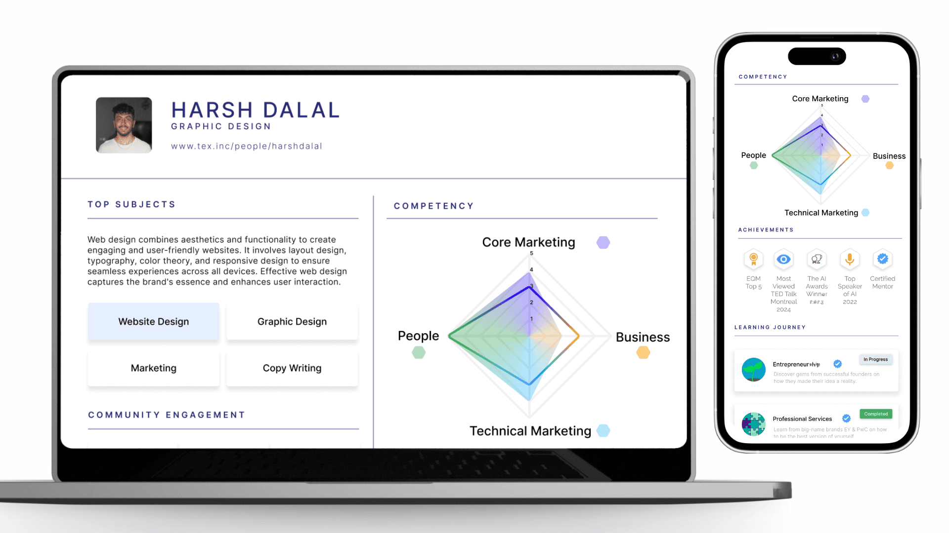
Stage 4. User Feedback & Refinement
User testing has started and will continue with a diverse group to gather feedback on the redesign. This process helped identify usability issues and validate new design elements. Based on feedback, iterative refinements were made to enhance the app's interface for better user satisfaction and engagement.
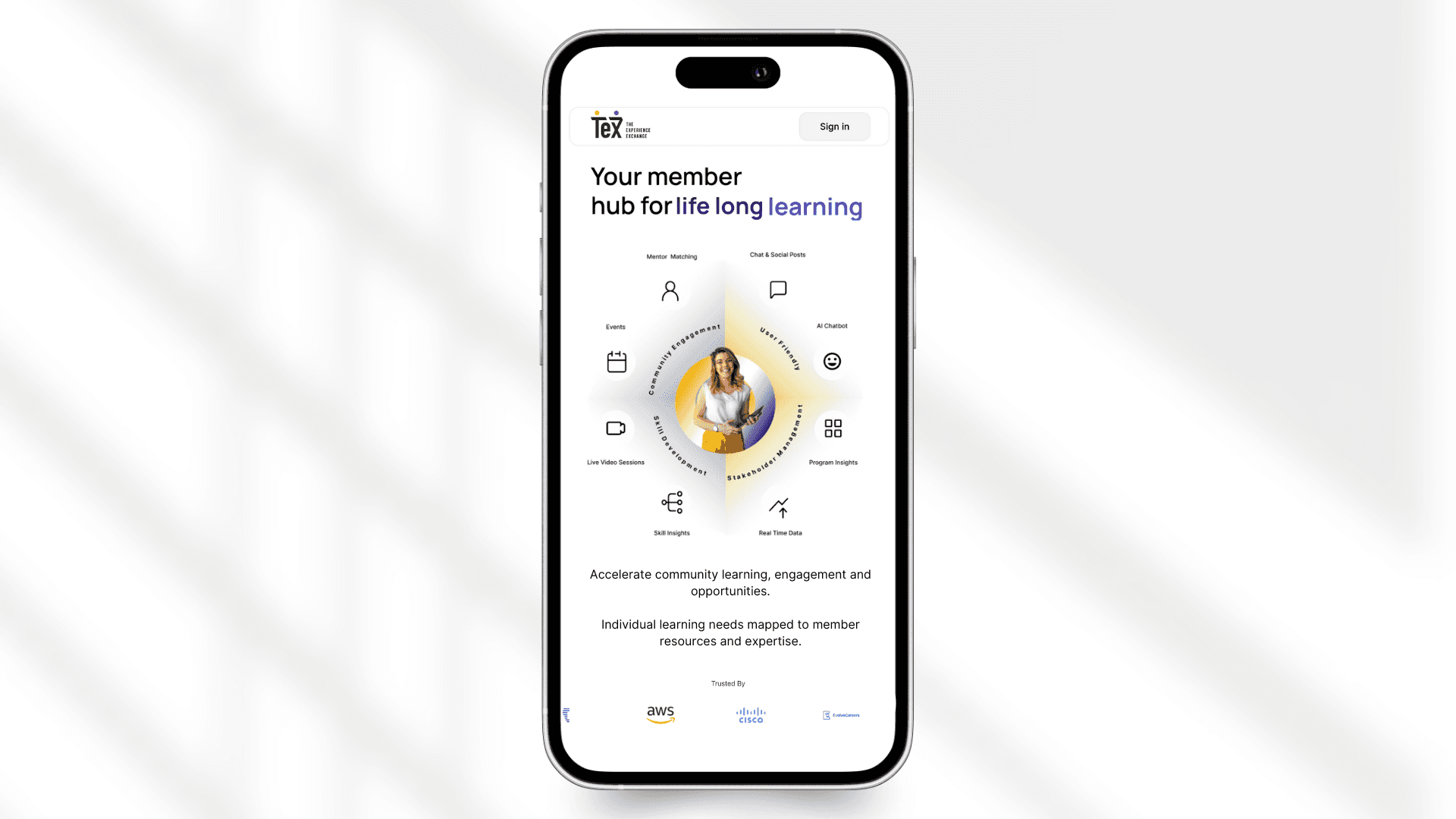
Stage 5. Implementation & Launch Support
Worked closely with developers to ensure a seamless design-to-implementation transition. Provided support during development, resolving design challenges. Played a key role in platforms relaunch, tracking user feedback to guide future updates.
Other projects
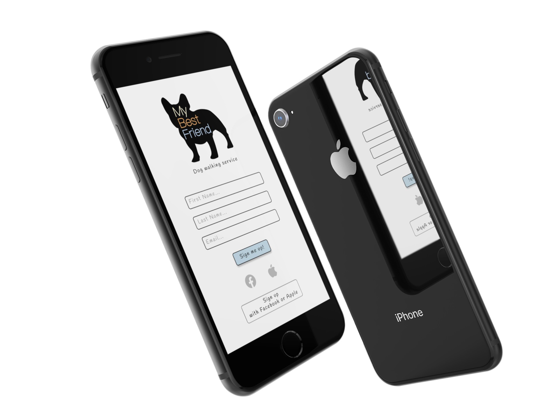
My Best Friend - Dog Walking App
My Best Friend aims to refine its UX research and complete the UI design for a mobile platform connecting dog owners with local walkers. Focused on flexibility and ease of booking, the design ensures a seamless transition from the app to real-world pickups. Through user research, wireframing, and testing, the project prioritizes an intuitive experience, keeping users engaged while simplifying the booking process.

Adonis
Mockup Beauty Product Design : The ADONIS mockup blends luxury and nature, embodying refined masculinity through minimalist branding, earthy tones, and sustainable packaging.

Yummy Beer
The Yummy craft beer mockup features a unique bottle-shaped logo, bold matte packaging, and sustainable materials, capturing the brand’s passion for brewing excellence and environmental stewardship.

JG
JG’s vibrant T-shirt designs are more than fashion—they’re a bold statement of creativity and defiance. Born during Melbourne’s lockdown, each design celebrates resilience, using bright graphics and striking colors to symbolize strength and perseverance.