Website / UX / Content
Redesign and ongoing optimisation of the Sphera website, improving usability, structure and engagement across a premium architectural lighting brand.
UX/UI Designer
Architecture / Lighting
Ongoing
Before & After
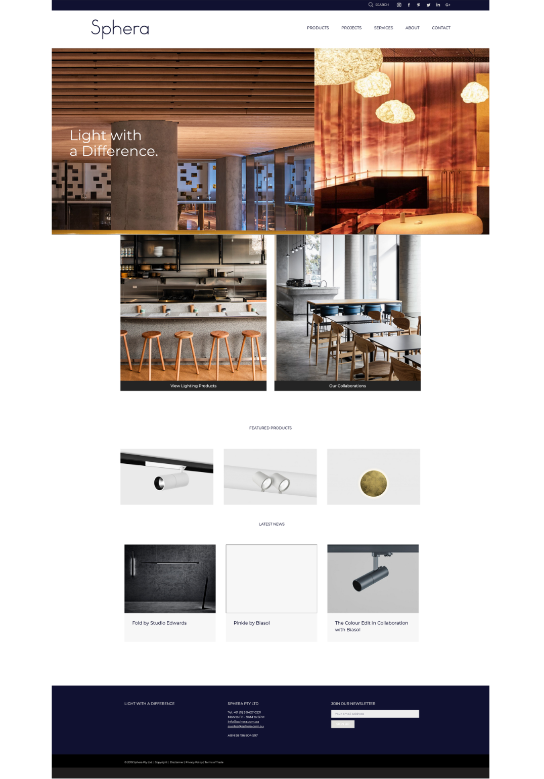
Before
After
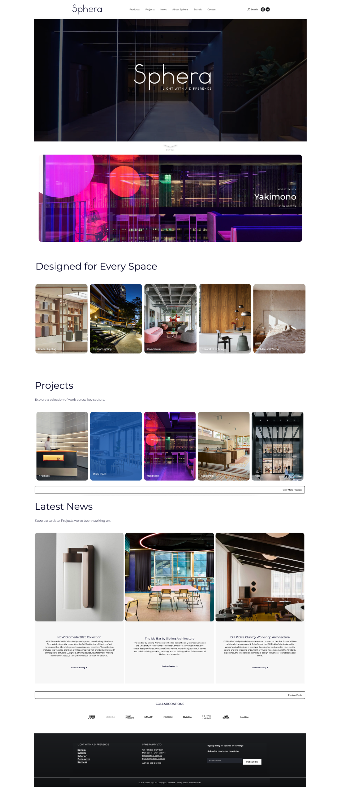
The original website lacked clear navigation, consistent hierarchy and defined user pathways. The redesign introduced a more structured layout, clearer content hierarchy and a stronger visual system, improving both usability and overall engagement.
Approach
Usability Audit
Conducted a full audit combining heuristic evaluation, user behaviour insights and performance data to identify friction across navigation, content structure and engagement.
Design Strategy
Defined a clearer product direction focused on simplifying user flows, improving content clarity and strengthening engagement across key touchpoints.
UX & Interface Design
Redesigned core journeys and page structures to reduce complexity and improve usability, supported by a refined visual system and more consistent interface design.
Implementation
Led the rollout across WordPress, ensuring alignment between design and build, with a focus on responsive performance, scalability and long-term flexibility.
Impact
The redesign resulted in improved engagement, clearer navigation and a more cohesive digital presence.
Users are able to move through the site more intuitively, with stronger visual hierarchy supporting content discovery and interaction.
